This article will introduce three typical two dimensional img layout.
The difficulty to achieve is from easy to hard.
I will use Vue to achieve, using vanilla JS is basically the same.
- grid responsive
- flexbox row (notice it will center last row)
- wookmark
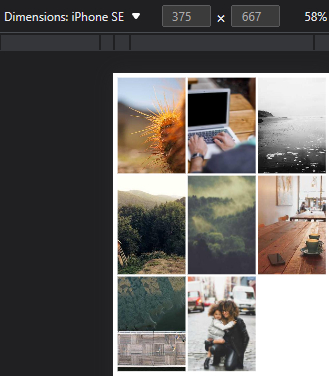
With code running, you can view my effect in the iPhone SE screen size, there are all responsive in other screen size with more imgs:
Let’s see how to achieve the above layout effect.
Check the code from repo, the code is easy to understand, I will only point out some import points.
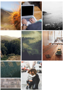
grid responsive
Project setup is in REMEAD.md file.
I have 8 img placeholder in public foler.
Below is src/App.vue file:
1
2
3
4
5
6
7
8
9
10
11
12
13
14
15
16
17
18
19
20
21
22
23
24
25
26
27
28
<script setup lang="ts">
const totalImgAmount = 8;
</script>

<template>
  <div class="container">
    <div class="img_container" v-for="i in totalImgAmount">
      <img :src="`${i}.jpg`" alt="" />
    </div>
  </div>
</template>

<style>
.container {
  display: grid;
  grid-template-columns: repeat(auto-fill, minmax(100px, 1fr));
  gap: 4px;
}
.img_container {
  aspect-ratio: 3/4;
}
img {
  display: block;
  width: 100%;
  height: 100%;
  object-fit: cover;
}
</style>
If there is no need for other layout, I recommend to use grid to achieve this easy two dimensional img layout.
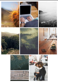
flexbox row
In src/App.vue file, I basically just calculate the last row's img amount, and set these last row’s imgs not grow and set it’s flex-basis same as above row's calculated width. If you change your screen size, you need to refresh the page to calculate again. you can add window.addEventListener('resize', callback) to recalculate it.
1
2
3
4
5
6
7
8
9
10
11
12
13
14
15
16
17
18
19
20
21
22
23
24
25
26
27
28
29
30
31
32
33
34
35
36
37
38
39
40
41
42
43
44
45
46
47
48
49
50
51
52
53
54
55
56
57
58
<script setup lang="ts">
import { onMounted } from 'vue';
const totalImgAmount = 8;
const imgBaseWidth = 100;
const gap = 4;
const screenWidth = document.body.offsetWidth;
const rowImgAmount = Math.floor(screenWidth / (imgBaseWidth + gap));
const lastRowImgAmount = totalImgAmount % rowImgAmount;

const setLastRowImg = () => {
  console.log(lastRowImgAmount);
  if (lastRowImgAmount) {
    const img_containers =
      document.querySelectorAll<HTMLDivElement>(`.img_container`);
    for (
      let i = totalImgAmount lastRowImgAmount;
      i < totalImgAmount;
      i++
    ) {
      if (img_containers[i]) {
        const imgWidth = img_containers[0].offsetWidth
        img_containers[i].style.flex = `0 ${imgWidth}px`;
      }
    }
  }
};

onMounted(setLastRowImg);
</script>

<template>
  <div class="container">
    <!-- note: v-for starts at 1 include last index -->
    <div class="img_container" v-for="i in totalImgAmount">
      <img :src="`${i}.jpg`" alt="" />
    </div>
  </div>
</template>

<style scoped>
.container {
  display: flex;
  flex-flow: wrap;
  justify-content: center;
  gap: 4px;
}
.img_container {
  flex: 1 100px;
  aspect-ratio: 3/4;
}

img {
  display: block;
  width: 100%;
  height: 100%;
  object-fit: cover;
}
</style>
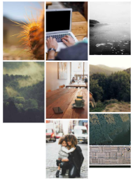
wookmark
In src/App.vue file, I set the col number and gap, other data will be calculate by these two value, notice to get the right auto img height value, we need to wait for the img loaded, then the auto img height will be calculated by browser.
1
2
3
4
5
6
7
8
9
10
11
12
13
14
15
16
17
18
19
20
21
22
23
24
25
26
27
28
29
30
31
32
33
34
35
36
37
38
39
40
41
42
43
44
45
46
47
48
49
50
51
52
53
54
55
56
57
58
59
60
61
62
63
64
65
66
67
68
69
70
71
72
73
74
75
76
77
78
79
80
81
82
83
84
85
86
<script setup lang="ts">
import { ref, onMounted, computed } from "vue";
const getMinItemIndex = (arr: number[]) => {
  let minItemIndex = 0;
  for (let i = 1; i < arr.length; i++) {
    if (arr[i] < arr[minItemIndex]) {
      minItemIndex = i;
    }
  }
  return minItemIndex;
};

const imgAmount = ref(8);
const containerHeight = ref(1000); // will be caculated after img loaded
const colAmount = ref(3);
const gap = ref(4);
const colWidth = computed(
  () =>
    (document.body.offsetWidth - gap.value * (colAmount.value + 1)) /
    colAmount.value
);
const imgRefs = ref<HTMLImageElement[]>([]);
const imgContainerStyles = ref<any[]>(new Array(imgAmount.value)); // calculated by imgRefs

const waitImgsLoaded = async () => {
  // wait for all the img loaded to get the right img height
  const promises = [];
  for (let i = 0; i < imgAmount.value; i++) {
    const promise = new Promise<void>((resolve) => {
      const listener = () => {
        imgRefs.value[i].removeEventListener("load", listener);
        resolve();
      };
      imgRefs.value[i].addEventListener("load", listener);
    });
    promises.push(promise);
  }
  await Promise.all(promises);
};

const setWookmark = async () => {
  await waitImgsLoaded();

  // caculate position
  const colHeights = new Array(colAmount.value).fill(0);
  for (let i = 0; i < imgAmount.value; i++) {
    const minHeightColIndex = getMinItemIndex(colHeights);
    const left = gap.value + minHeightColIndex * (gap.value + colWidth.value);
    const top = colHeights[minHeightColIndex] + gap.value;
    imgContainerStyles.value[i] = {
      position: "absolute",
      left: left + "px",
      top: top + "px",
    };
    colHeights[minHeightColIndex] += gap.value + imgRefs.value[i].offsetHeight;
  }

  containerHeight.value = Math.max(...colHeights);
};
onMounted(async () => {
  await setWookmark();
});
</script>

<template>
  <div :style="{ height: containerHeight + 'px' }" class="container">
    <div
      v-for="i in imgAmount"
      class="img_container"
      :style="{ width: colWidth + 'px', ...imgContainerStyles[i - 1] }"
    >
      <!-- this i starts at 1 -->
      <img ref="imgRefs" :src="`${i}.jpg`" alt="" />
    </div>
  </div>
</template>

<style scoped>
.container {
  position: relative;
}
img {
  display: block;
  width: 100%;
}
</style>